)
Hey besties!
Today’s project is for the Clean and Simple Boutique Cards class in the Altenew Educator Certification Program—and I’ll be real with you. “Clean and simple” is not my natural habitat. I’m more of a “layer it until it needs postage tape” kind of cardmaker. 😅
But this class made me slow down, simplify, and look at my stamps in a new way—and I walked away with a huge mindset shift:
Any stamp can become a background stamp.
Let me show you how that lesson came to life in two different ways.
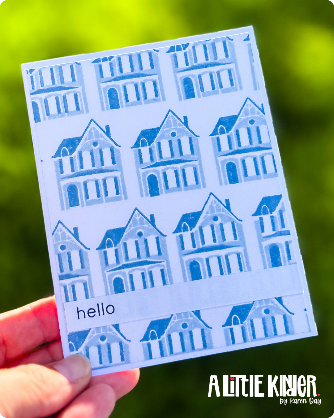 Blue House Background
This card was my clean-and-simple challenge to myself. I used a 2-step layering stamp of this adorable house and repeated it to create a custom background. It’s all stamped in blue tones for a crisp, monochromatic feel that doesn’t overwhelm the eye. And even though it’s technically stamped over and over again, it still feels calm and intentional.
Being 100% transparent… this was hard. IT’s a simple card front panel over a card base. I did layer the sentiment on a white cardstock band across the card front. But best friend… I wanted to add layers so badly!!
If I were to “add” to this card, I would add a blue layer that I ink blended with the darker blue color between the card front and the card base. I would also pop up the white sentiment strip and add some silver thread under where I stamped the word “Hello”.
I stamped the solid layer of the house using a lighter blue from my Altenew ink set. Then I layered the detail stamp on top in a deeper coordinating shade. (Pro tip: Use a stamp positioning tool if you’re worried about getting things straight.) I repeated the image in a grid pattern across the card front. To keep the “boutique” vibe from the class, I scored lines on the white sentiment strip for texture and stamped “hello” in Jet Black.
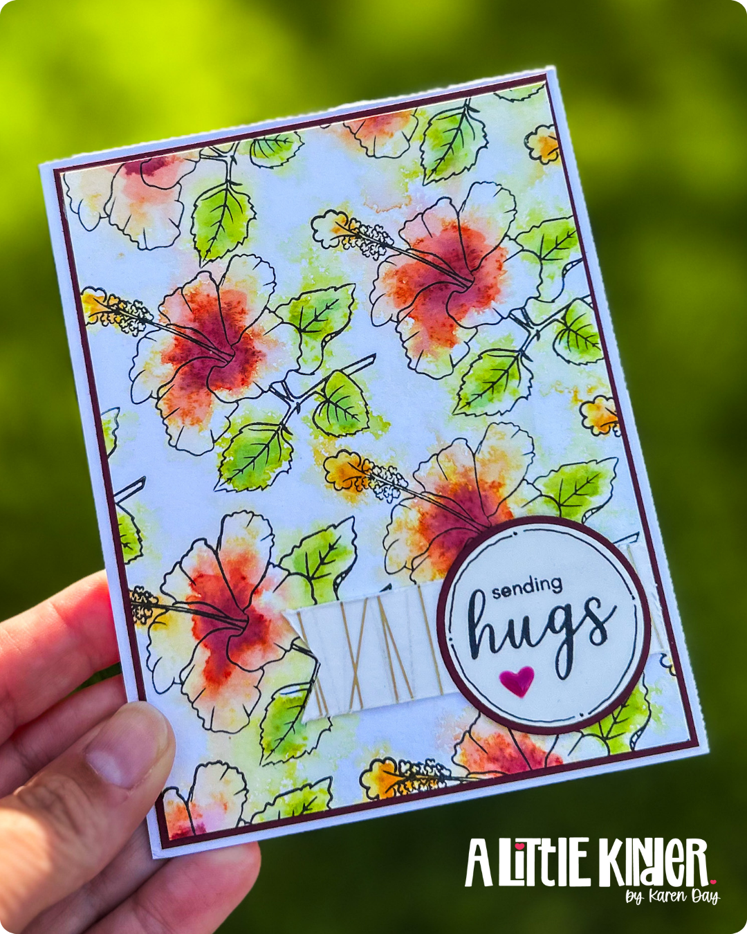 Watercolor Florals with a Touch of Gold
Inspired by a stunning watercolor background demo from Jennifer Rzasa in the class, I used a hibiscus stamp to create a full floral pattern, then loosely watercolor-painted the images for a dreamy, artistic look. This looks fantastic finished off but man… the watercolor did not look great in process. This was one of those “trust the process” cards. And I didn’t want to trust the process. So while this card panel dried I made the blue house card. Yeah I didn’t like it that much! LOL
In the end this card felt like a beautiful rebellion against perfection—just letting the paint and water do its thing. So once the panel was dry, I knew it had to be finished out. To elevate the card to that boutique level the class talked about, I added a strip of gold washi tape beneath the sentiment. Metallics = instant glow-up. It really looks like I wrapped gold thread around that white cardstock… but it’s the washi tape doing what washi does! Making everything better!
Takeaways from the Clean & Simple Boutique Cards Class:
-
✨ Any stamp can be a background. (Yes, even the tiny ones. Yes, even words!)
-
✍️ Hand-drawn pen work with a Micron or Altenew pen adds personal flair.
-
🔥 Scoring = crisp folds. It’s one of those tiny details that makes a card feel finished.
-
💛 Metallic touches = boutique vibes. A sliver of gold or silver can take your card from hobby to high-end real quick.
Final Thoughts
I’ll be honest—this class challenged me in all the right ways. Clean and simple doesn’t have to mean plain. It can be thoughtful, fresh, and just as expressive. And sometimes stepping outside your style helps you stretch into something even more creative.
Until I see you again…
Try the things. Make the mess. Stay inspired!
1 Comment. Leave new
Love these cards, especially the one with the houses!