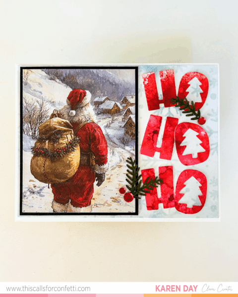 This card feels like a big holiday hug. Cozy, classic, a little cheeky—and full of all my favorite things to play with this season. After finishing my last Santa card, I couldn’t resist diving into the same ephemera pack from This Calls for Confetti again. There’s just something about the artwork and warmth in these illustrations that gives your cards instant storybook charm. And this time, I paired it with something bold and playful—the HO HO HO Layering Stencil and Die Set.
This entire design came together around the idea of balance. On the left, we’ve got soft watercolor-style artwork and vintage vibes from the Santa. On the right? Bright, high-contrast color with dimension and bold lettering. And that combo just works. It feels like the old and new parts of Christmas blended into one card.
Let’s start with the background. I lightly ink blended a piece of white cardstock using the Snowfall stencil and Polar Bear ink from Altenew. It’s such a soft icy blue and gave me just enough pattern to keep the background from looking flat, without taking any attention away from the HO HO HO. That layer sets the tone for the rest of the panel and helps all the other elements shine.
The HO HO HO itself was created using the coordinating layering stencil and die set. I blended a few different reds from my stash to get that painterly, saturated look—no perfect blending required here. I actually love that the tones shift and overlap. It gives it more energy and movement, like those letters are bouncing across the panel. Once I was happy with the blend, I used the die to cut out the letters and their shadow shapes, then layered everything together for extra pop. I used white cardstock for the shadow layers behind the Os so the little Christmas trees could peek through clean and clear. It’s playful and festive and ties right back to Santa’s outfit.
 The Santa ephemera piece is layered on a small black mat to help it stand out and add definition. I love the way the warm brown in his sack plays off the greens and reds on the HO HO HO side. It makes the whole card feel intentional without being too matchy-matchy.
For a few finishing touches, I added some pine sprigs, a couple red embellishments, and called it good. The texture and shine from just those few details made it feel finished without overcrowding the design.
I had so much fun working on this card. It’s a reminder that your holiday cards can feel nostalgic and modern at the same time. You don’t have to choose between clean and bold or cozy and detailed—you can do both on the same card.
Want to make one like this? You can grab everything I used—Santa ephemera, the HO HO HO stencil and die set, Snowfall stencil, and more—right here:
https://bit.ly/tcfc_karen
There’s still plenty of time to get your holiday cards going. And honestly, with tools like these, it feels more like fun than a to-do list. So go ahead, make something magical.