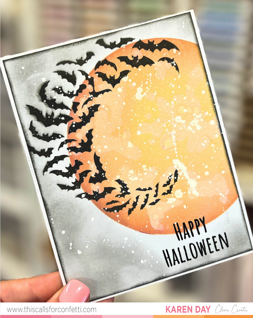
 This card might look dimensional, but surprise—it’s a one layer card.
And for me? That’s a BIG deal.
I normally lean into layers, foam tape, die cuts—the works. But this time, I challenged myself to go full flat… and honestly, I think that made the background shine even more.
This card was created for a fun Instagram hop focused on stencils (you can find this hop @alittlekinder on IG), and I knew right away I wanted to feature the Halloween Scene Building stencil set by This Calls for Confetti. It’s got everything you need to build a spooky little moment on paper: a graveyard, a creepy tree, fluttering bats… and the biggest, boldest moon ever. I couldn’t resist making that the star.
Building the Scene: All in the Ink
The magic of this card came together with nothing but Distress Oxide inks, stencils, a brush, and some creative blending. Here’s a peek behind the curtain:
-
The moon was my starting point. I blended it with warm oranges and yellows, then went back over it lightly with white pigment ink to bring out those “lunar spots.” It gave it that perfect cratered effect without needing texture paste or embossing.
-
Around the moon, I used Black Soot Distress Oxide, but instead of applying it all one way, I varied the pressure of my blending brush to create those moody light and dark patches. That variation is what gives the card depth, even without any raised elements.
-
The bats were stenciled in Altenew Pigment ink over the moon. I love how they look like they’re flying around the light—it adds so much movement to the design.
-
To finish off the background, I added white paint splatter, because let’s be honest… when in doubt, splatter it out. It gave the card that dreamy, starry-night texture and helped tie everything together.
 Let’s Talk Sentiment Placement (This Trick Is a Game-Changer)
I knew I wanted the “Happy Halloween” sentiment to sit near the bottom of the card, but placing it just right on an ink-heavy background can be nerve-wracking—especially on a one-layer card where there’s no covering up mistakes.
Here’s my go-to trick:
I used my MISTI and a piece of clear plastic. I stamped the sentiment onto the plastic first, then laid the plastic over the card to test different placements. When I found the perfect spot? I just peeled the plastic away and stamped directly onto the card. Easy, stress-free, and accurate.
Final Thoughts: Flat Doesn’t Mean Boring
This card reminded me that a one-layer design doesn’t have to feel flat or simple. With thoughtful ink blending, a strong focal point (hello, giant moon), and a little splatter magic, you can get so much depth and drama—without adding a single foam square.
I hope this inspires you to play with stencils in a new way, or even challenge yourself to try a one-layer card if they normally feel intimidating. The Halloween Scene Building stencil truly made it feel effortless—and that’s saying something coming from a layer-loving crafter like me!
Have you ever made a one-layer card that surprised you? Or do you tend to avoid them? I’d love to hear your thoughts and tips in the comments below!
And if you came here from Instagram—hi friend! You can find more behind-the-scenes crafty chaos over at @alittlekinder. Come hang out and create with me. 🎃🖤