 Hey besties!
I’m officially kicking off my journey in the Altenew Educator Certification Program, and this post is all about my first class: All About Layering 3. Let me just say—this class surprised me in all the best ways.
I started off thinking, “How much can you really say about lining up stamps?” Turns out… a lot. And it’s worth every second.
Let’s be honest: when I started the All About Layering 3 class, I kinda rolled my eyes at how much time was spent talking about lining things up. I thought, “Really? We’re gonna deep-dive THAT hard into stamping placement?” Spoiler alert: I ate those words with a side of ink-stained fingers.
This class covered 5 or 6 different Altenew layering sets and walked through all the nitty-gritty of lining up the layers just right. And you know what? I’m so glad it did. Turns out, those tiny tricks—like adding a pencil mark outside the image to help position your stencil—saved me a ton of frustration once I got stamping.
My Creative Process (a.k.a. Practice Makes Progress)
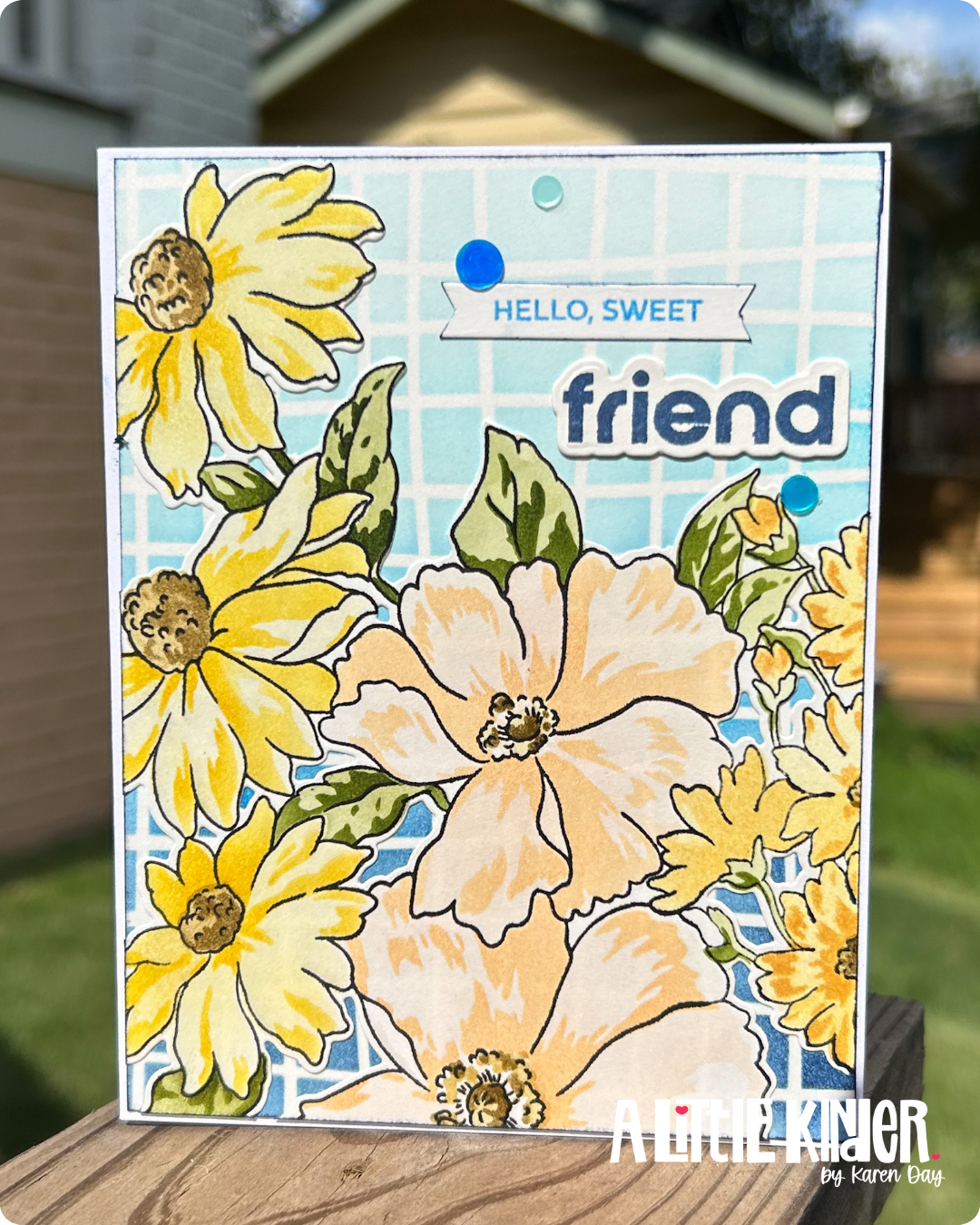
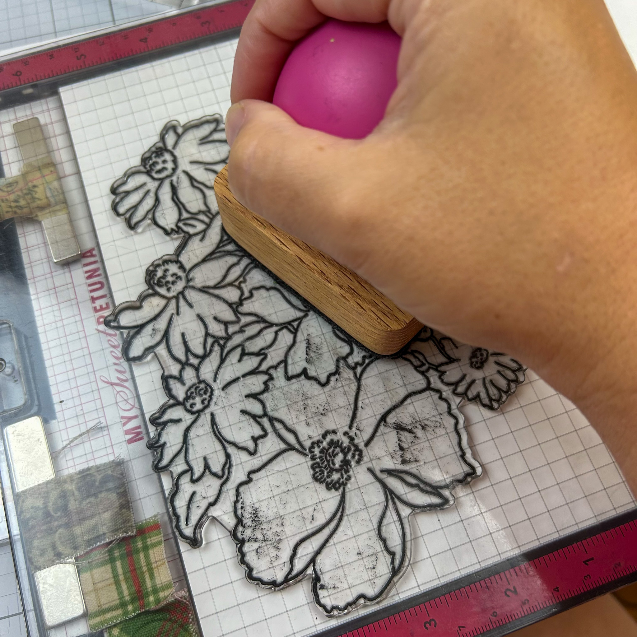 I started off by stamping several of the florals from the Craft Your Life Project Kit: Flourishing Garden in Jet Black onto Strathmore marker paper. Then I got to work playing with the layering stencils. The first few tries? A little wonky. But the more I did it, the better it got—and by the end, I was cruising.
Color combinations for this stamp make it pop, or keep it muted and blended. I wanted to really highlight warm fall mum type colors. Think yellows, and browns, and peaches. My mom always has fall mums in her kitchen. She loves them so much and this image, although not mums, gave nod to the fall mum. I started with the creamy yellows on the right side of the image. One thing that I really am loving about the Altenew ink cubes, is that there are 4 in a set, rather than 3 from other companies. This gives a little more depth between the light and dark of the set. And for me as the artist… a LOT more room to play with color combinations. Let’s talk about those color combos.
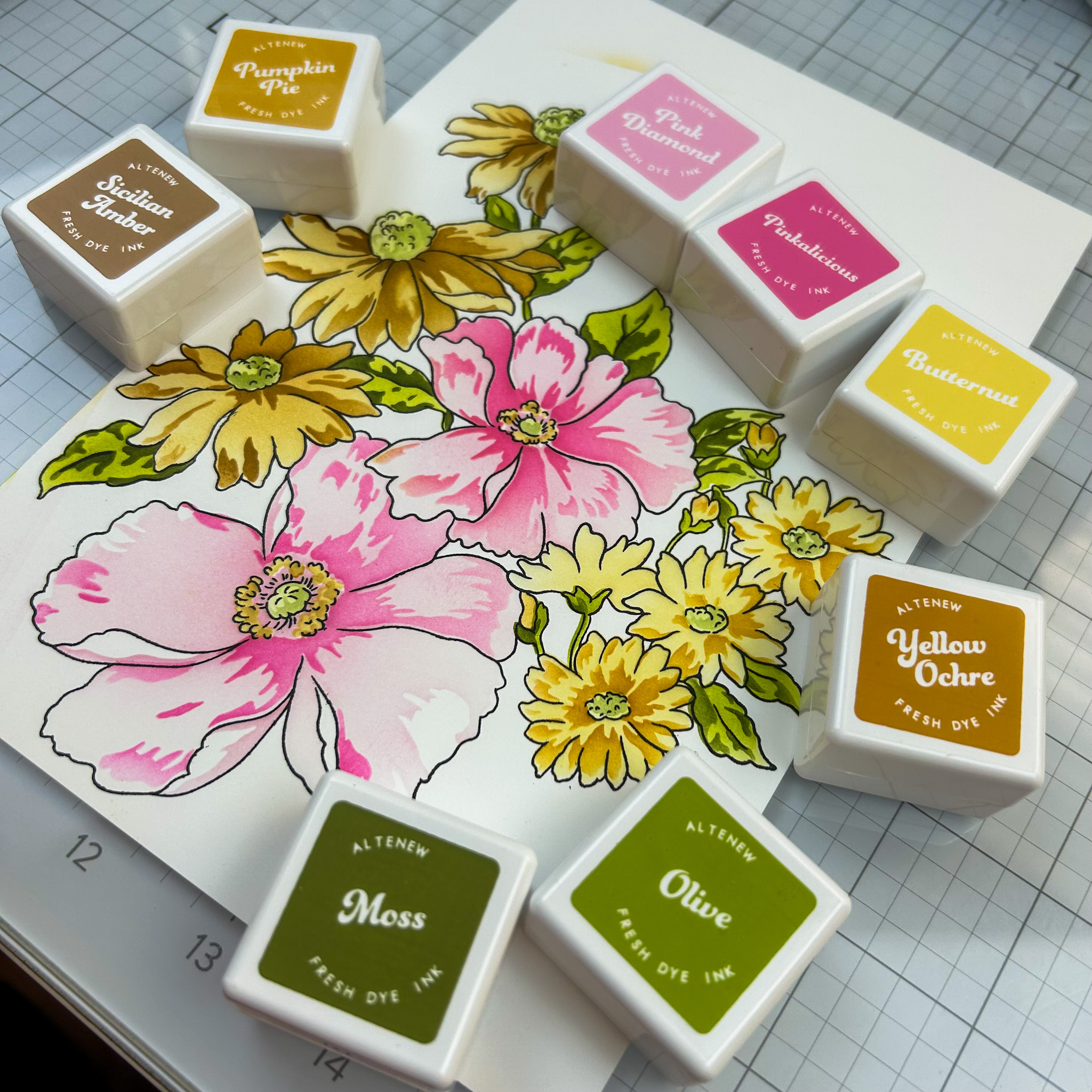 I tried several different color combinations before deciding on the one I used in my finished card. One of the combos I really liked but it didn’t fit the vision I had for this card- fall mum. Since we are talking color, I thought I would share this version of the final colored image. In the All about Layering 3 class, there is a LOT of discussion about getting things to match up and one tip given is that if the stamp set has an out line image to use that to help with placement. This image really does help with figuring out what color goes where.
In this version, I used the Fall Harvest color quad to get the creamy yellows and golden browns that scream fall mum. For the large center flowers, I wanted to see what pink would look like. Yes I know, not a fall mum color, but pink is my go to when I want to see what shading will look like. It really is my favorite color. So here is another tip… when you are using a layering stamp set or stencil, use a color that you can see all the shades in your mind’s eye. Here is what I mean… with pink I can see the lights and medium and dark shades of that color without the ink on the page. My mind sees those shades easily (probably because I love pink so much lol). This really helps as you look at the layers and decide what shade goes where, when you have NEVER used that set before. Another why to see or do this is to swatch your inks. This would allow you to have those shades on paper where you can see them. I do swatch every ink that comes into my space, if you aren’t doing that- friend! Let’s chat about why.
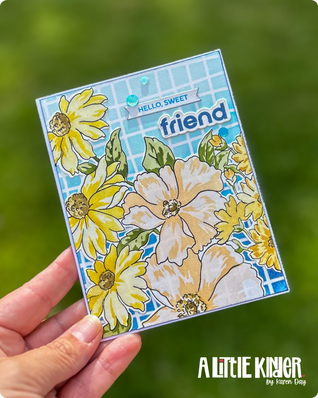
 Once I had a little floral army cut out using the matching dies, I played around with arrangements on a few different card bases. I tried solid cardstock. I tried die-cut backgrounds. None of it felt right. Then I blended Deep Blue Seas ink through the Wavy Grid Stencil, and HELLO MAGIC. It gave serious “garden trellis on a summer day” vibes. So fresh. So clean. So dimensional.
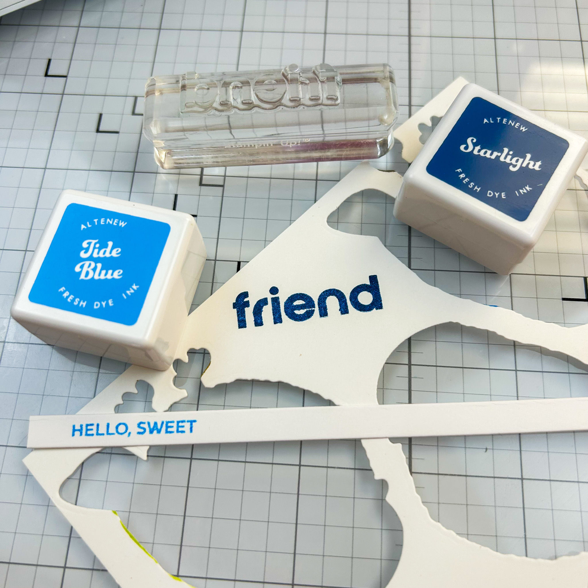
Now each card needs some kind of sentiment. For this card, I decided to use some of the words that came with the stamp set. I knew I wanted to make a “stacked” title. For me this means that I have a bold word with smaller words stacked together to make one sentiment. I stamped my title in a couple different color ways. I started with black. And while this would have been a good choice… it was boring. I stamped it in the “yellows” and it faded into the background. SO back to the blues I went. And Y’all!!! I was so surprised that the blue actually popped on the ink blended background. But it did and I love! So here is to trying more than one thing to get to the best version of a card. Now let’s talk about how I added a little dimension without using foam tape. I die cut the sentiment “friend” multiple times and stacked the layers. I was able to determine just how thick I wanted this to sentiment to be. And with postage steadily climbing, I was able to give some depth without pushing my card into needing more postage. PSA: This is such a good foam tape alternative when you want dimension without the bulk.
Some real world take aways that I will use over and over!
-
The printed layering guide is helpful—but practice is better. I LOVE that Altenew gives us a guide. But it’s just that… it’s a guide. You need to put ink to paper. And over and over. This does so much. 1. It creates muscle memory for that stamp set. You know where things go. 2. you get to try out different color combos. Wondering if those two colors would work together… grab some paper and TRY it! 3. You end up with stamped or stenciled images that you can use on future cards.
-
Conditioning your stamps by using them a few times first makes a huge difference. Ok ok… I know I’ve been stamping for ever and I used to roll my eyes at this tip. I mean really! I would take my stamp and stamp it off in ink and clean it. Y’all this is NOT stamp conditioning. Yes it helps but it really doesn’t do the job completely. Since starting this journey, wanting to get the most out of my time in the certification program, I decided to follow the advice of using a stamp conditioning tool. Altenew sells one, and I think that this really does a great job. On a budget: check your stash. Do you have a Mars plastic white eraser? I did. And it works similarly to the Altenew stamp conditioner.
-
It’s okay if your first (or fourth) attempt isn’t perfect. You’ll get better with every try. Ahh so much truth to this! Not getting the results you were hoping… stamp it again. Confession… there was a time where my budget was so tight that the idea of “tossing” or “doing it again” was so hard! All I could see was dollar signs. Here is what I wish that crafter knew… it’s better to grab some cheep copy paper and practice than to end up with a project that you are not happy with.
Let’s wrap this card up…
At one point, I had flowers laid out on like, four different backgrounds. Nothing was clicking. The colors were right, but the vibe? Off. I had to walk away and come back (with an Edge+, obviously). That’s when the stencil idea hit, and once I saw that pattern peek through the blooms, it felt like the card finally clicked into place. When you look at my card you would never guess that it was created over several days. Even though I knew I wanted to complete the “homework” with a finished card, I gave myself permission to just be in the class… learn new things… try it the way it was presented… and in the end, I have an amazing card. Backed up with some really important tips and tricks that I can use every day in my crafting. Creative magic sometimes needs a little trial, a little error, and a lot of layering.